
Designing a digital solution for Faktum
UX Research / Wireframing / Prototyping / User testing / UI
When
January 2024 - May 2024
client
Faktum (Through HIVE, the Humblebee student lab)
The summary
Through a meticulous research phase we noticed quite early a recurring theme of frustrations among the buyers of the Faktum magazine. As the vendors only were assigned a vending spot, and managed their working hours themselves, there was no way for a potential buyer to actually know if that vendor in particular were really there, selling their magazines.
After multiple iterations through an agile design approach, our product resulted in a multifaceted, fully functioning web app. Here, the potential buyers were able to see on an interactive map interface which vendors close to them that were currently selling the Faktum magazine.
On a hidden url to the same app, the vendors of Faktum were able to both edit what information was presented of them in the buyer interface, as well as the ability to toggle their vending status between “active” and “inactive” however they wanted. An admin dashboard was also designed, aiming at allowing the Faktum staff to activate/deactivate vendor vending statuses of those vendors who yet did not have access to smart phones or a computer.
The user
Faktum vendors, buyers of the magazine, and the Faktum distribution staff
Role
UX Designer in a cross-functional team
The challenge
Me and my team were to design and develop a service and/or product that would strengthen Faktum and its vendors digital presence. This without losing the soul and essence of Faktums business model; a way for people suffering from poverty, homlessness and social exclusion to get access to a real job and a real income.
The process
As part of the HIVE student lab at Humblebee, we were connected with Faktum, Swedens largest street newspaper. Faktums business model consisted of selling their magazine to their vendors, who then sold the magazine on to people like you and me. Faktums vendors are people that for one reason or another are suffering from homelessness, social exclusion and poverty. Faktum wants to provide means for the vendors to provide for themselves, every magazine sale goes straight to the vendors wallet, instead of Faktum getting a “cut of the sales”.
Faktums customer brief was indeed short, but it was intentionally worded that way in order to give our team the maximum amount of solutions without getting constricted by tight guidelines. It was as follows:
“Design and develop a digital service and/or product that strengthens the relationship between Faktums vendors and their buyers”
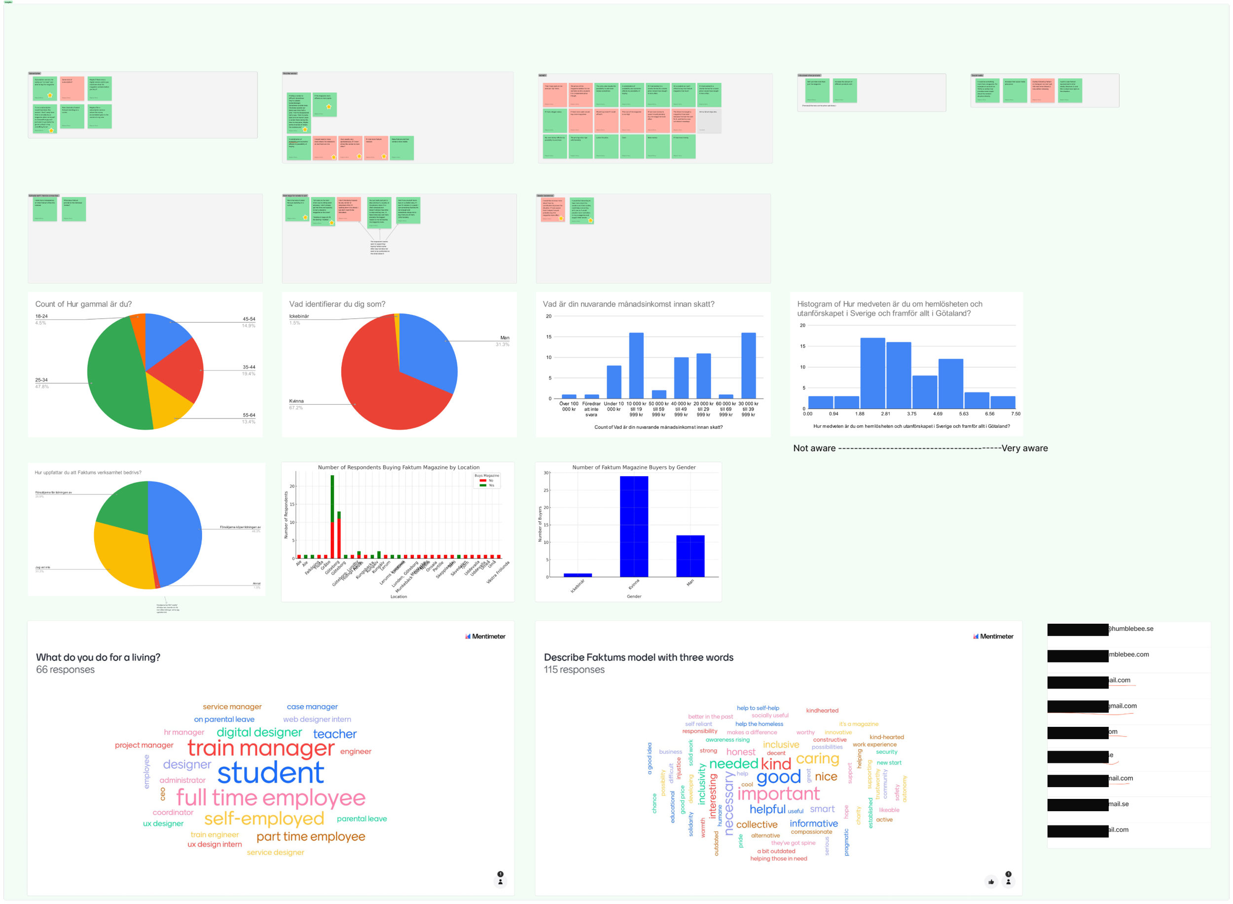
Working agile and with the Design Thinking methodology intiated the research phase. I took the role of UX researcher and gathered quantiative research through online surveys and email forms. I also had access to secondary research in the form of previous surveys which proved highly beneficial in gathering insights we might not have gotten through our primary research alone. Qualitative research was gathered through both user and expert interviews, user shadowing, cultural probes and service safaris.
Quite early on a pattern emerged in the findings; there was a frustration in how the buyers weren’t always able to find a Faktum vendor. This pain point was a recurring theme in our research phase and came from many different instances unrelated to each other.
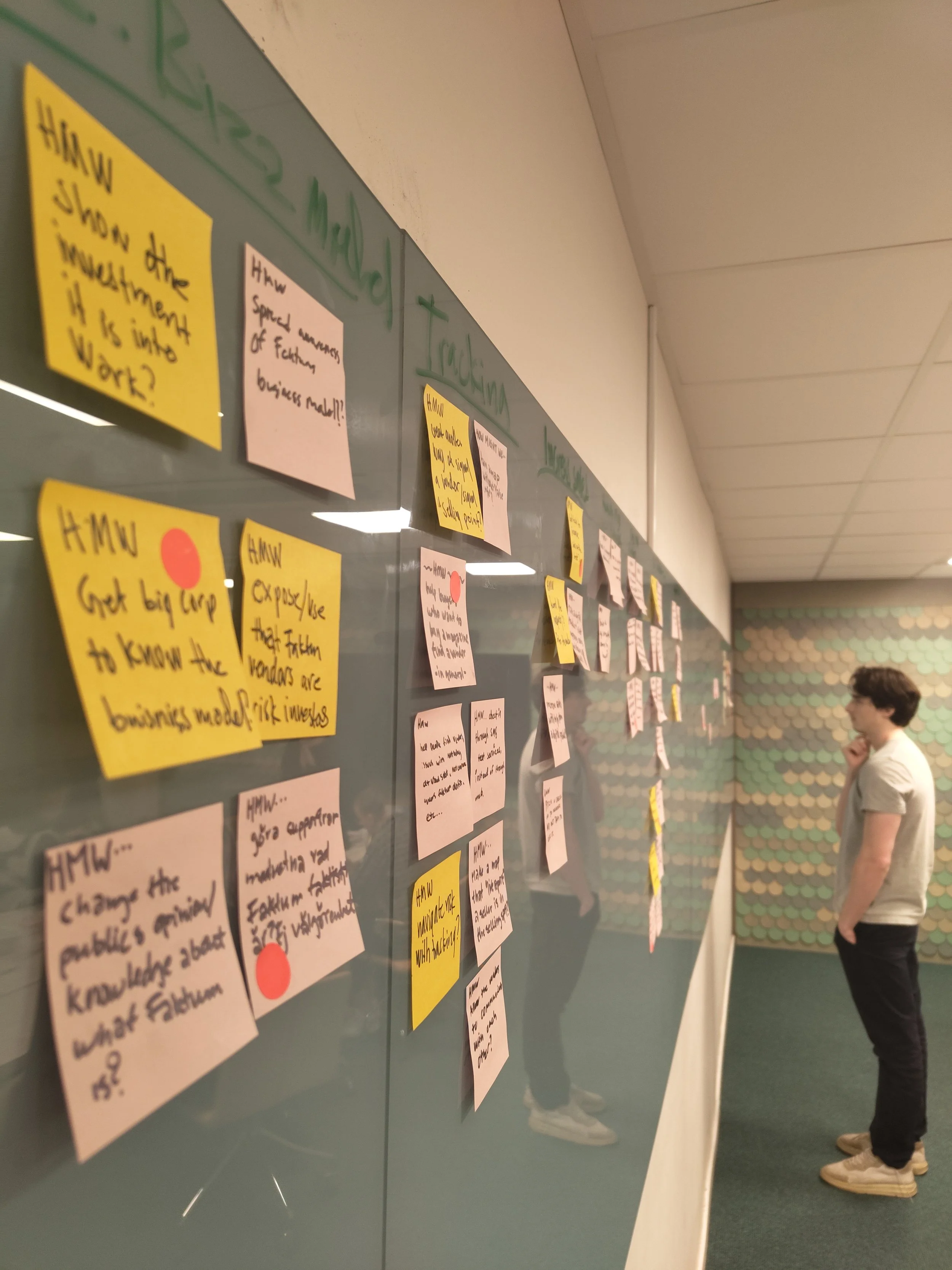
The expert interviews showed that Faktum wanted to keep their magazine analog. This meant that there was no room to transform it into an e-magazine as this would disrupt the sales of the users that benefitted from Faktum the most: the vendors. With this in mind we conducted a design sprint alongside our stakeholders.
The research phase and design sprint concluded with a clear goal in mind; me and my team were to develop a webapp-based tool that would target our three defined user groups: the vendors, the potential buyers and the Faktum staff themselves. Following the Double Diamond me and the team sat down and converged on the definition of the MVP to be developed for Faktum.

Evolution of the buyer prototype

Finalized version of the vendor side of the platform

Admin dashboard
Going through the process, we realized that it could prove a security concern if we would put the name and face of a user from an already vulnerable user group up online. To alleviate this we wanted the vendors to feel safe in creating their user profile. Whatever information they wanted to share was displayed on the buyer side. The only mandatory connection we need for the platform was to connect the vendors selling spot to a phone number. The main focus was on making sure the vendors felt safe with what information they would be sharing online. Should the vendor in the process of creating their user profile not check in the consent checkbox, he or she would show up as an anonymous vendor in the buyers interface.
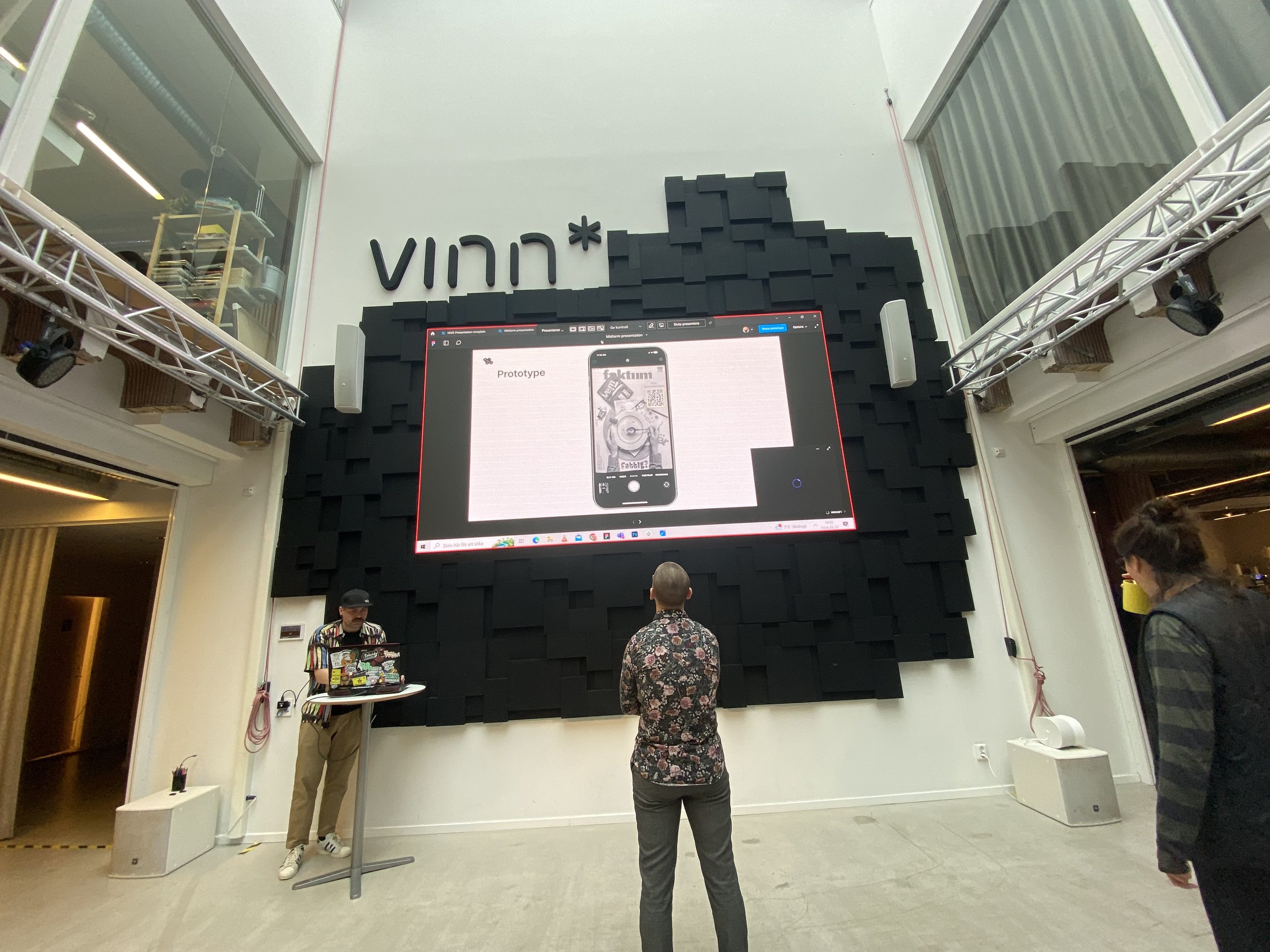
The platform went through every single stage of the design thinking process, until it after six vastly different iterations was in the shape of an MVP worthy to be presented to the stakeholders. There, it was very well received and plans to launch a pilot to try out in real life was being talked about.
After careful consideration, what then took shape was a web based application that would function as a multifaceted tool for our different user groups. For the potential buyers, we wanted to provide a GPS-based map of the users location and nearby Faktum vending spots. The user were able to easily see what vendors around them that was actively selling the magazine, as well as being able to read a small presentation of the vendor. Should the user chose the main CTA, “Find me”, the app would direct them to their native GPS app with directional instructions on how to find the vendor.
The vendors side of the tool was a more static version where they had the ability to activate/deactivate their vending status with the flick of a button, as well as the ability to edit how their “profile” was displayed to the buyer. This side was designed with the focus on symbology instead of text, making the primary CTA, the activate/deactivate button, a large stick figure and a slider button. When clicking the slider button, the stick figure would either raise a magazine above its head, indicating that the vendors status is currently set to “selling”, or lower its arm and change colour, indicating that the vendor is not currently selling Faktum.
I discovered in our early iterations that not all vendors had access to a smartphone, desktop or in some cases mobile data, which made me realize that there was a need to design a “low tech” solution to our challenge. Careful not to fall victim to the scope creep, we designed an Admin Dashboard for the Faktum staff to use. The relationship between vendors and the Faktum staff is a major cornerstone of their business model, and through involving the Faktum staff in this project gave them even more ways of helping each other out.
The Faktum admin dashboard were to alleviate the pains of not having access to web applications as a vendor. By calling in to the Faktum headquarters, vendors could easily ask the Faktum admin to easily change their vending status. This was vital for the platform to reach as many vendors as possible.
A texting service was also utilized in case the vendor did not want to call Faktum. Taking inspiration from parking services using text based parking. The vendor would be sending a text to a certain number, and the predeveloped code would kick in to change the status of the vending spot connected to that number to active or inactive. To further keep the vendor in the loop, a reply from the number would be sent where it would state if what the vendors current status was.
The admin dashboard also provided ample means for keeping track on what was presented at the vendor side. With this, Faktum staff were able to not only activate/deactivate vendor statuses, they could also get an overview of what vendors were currently active, as well as adding, editing and removing vendors from the database.

Lessons learned:
Always expect the unexpected:
Going through a user testing session with a vendor, me and my teammate realized that even if there was a requirement to speak english and/or swedish in order to be eligible to sell the Faktum magazine, there wasn’t any requirement to be able to read it. This was after we had designed the entire platform based on the assumption that our primary user group, the vendors, were able to understand what we had been writing in the vendor side of the app. This was quite a surprise and forced us to rethink the entire concept, refocusing on symbology instead of text.
To do, doing, done:
I do love a good kanban board. From the get go this was our go-to method of tackling this massive opportunity recieved. By structurizing it so that every task was divided up in smaller tasks, and they in turn divided into even smaller tasks, adhering ot the iterative process became a walk in the park. This will here on out be my go-to method to tackle any challenge, even if it’s just for myself and I need to clean the apartment.
Consider this a learning journey:
It quickly showed that I and one of my teammates had vastly different ways of tackling problems in our design tools. Whilst they had one way of designing things in Figma, I had another. This could sometimes be confusing, but in the end when we’ve both started to learn from each others way of looking at things, it all got much easier. Do not be afraid to observe, adapt, and get better even if you disagree at first.